Let’s face it—we’ve all stumbled across websites that look like they were designed in 2005. You know the ones: flashing banners, clunky navigation, and colors that make your eyes hurt. On the flip side, we’ve also seen those sleek, modern sites that make you go, “Wow, this is nice.” But here’s the thing: a website can’t just be pretty. It has to work well, too. That’s where digital elegance comes in—the sweet spot where beauty meets functionality. In this post, we’ll break down how to design websites that are as functional as they are beautiful, without sacrificing one for the other.
The Essence of Digital Elegance
So, what exactly is digital elegance? It’s not just about making something look good—it’s about creating a seamless experience where design and functionality work together like a well-oiled machine. Think of it as the digital equivalent of a perfectly tailored suit. It looks great, but it’s also comfortable and practical.
Why does this matter? Because first impressions are everything. When someone lands on your site, they’re making snap judgments. A cluttered, confusing design can send them running for the hills, while a clean, elegant layout keeps them engaged. Plus, a well-designed site builds trust. If it looks professional and works smoothly, people are more likely to stick around.
Take Apple’s website, for example. It’s minimalist, visually stunning, and incredibly easy to navigate. Every element serves a purpose, and nothing feels out of place. That’s digital elegance in action.
Key Principles of Functional and Beautiful Design
Simplicity and Minimalism
Let’s start with the basics: simplicity. A clean, minimalist design isn’t just trendy—it’s effective. When you strip away the unnecessary clutter, you’re left with a site that’s easy on the eyes and easy to use. Think about it: would you rather scroll through a wall of text and ads, or a sleek page with plenty of white space and clear headings?
Minimalism also helps guide the user’s attention. By focusing on the essentials, you can highlight what really matters—whether that’s a call-to-action button, a product feature, or a piece of content.
Intuitive Navigation
Ever been on a website where you couldn’t find what you were looking for? Yeah, it’s frustrating. That’s why intuitive navigation is key. Your menu should be easy to find, your links should make sense, and your user flow should feel natural.
A good rule of thumb is to keep your navigation consistent across all pages. If your menu is at the top of the homepage, it should be at the top of every page. And don’t forget about breadcrumbs—they’re a lifesaver for helping users retrace their steps.
Responsive Design
In 2024, there’s no excuse for a website that doesn’t work on mobile. Seriously, none. Responsive design ensures your site looks great and functions well on any device, whether it’s a desktop, tablet, or smartphone.
A mobile-first approach is a smart way to go. Start by designing for the smallest screen, then scale up. This forces you to prioritize what’s really important, which leads to a cleaner, more focused design.
Performance Optimization
Here’s the thing: even the most beautiful website is useless if it takes forever to load. Performance optimization is all about finding that balance between high-quality visuals and fast loading times.
Compress your images, minify your code, and leverage browser caching. These small tweaks can make a big difference in how quickly your site loads. And trust me, your users will thank you.
The Role of Aesthetics in Web Design
Typography
Typography is one of those things you don’t notice when it’s done well, but you definitely notice when it’s not. The right fonts can make your site look polished and professional, while the wrong ones can make it feel amateurish.
Stick to two or three fonts max—one for headings, one for body text, and maybe an accent font for special elements. And please, for the love of all things digital, make sure they’re readable.
Color Theory
Colors aren’t just decorative—they’re functional. They can evoke emotions, guide user behavior, and reinforce your brand identity. A well-chosen color palette can make your site feel cohesive and intentional.
When picking colors, think about contrast. Your text should be easy to read against the background, and your CTAs should stand out. And don’t forget about accessibility—make sure your color choices are inclusive for users with visual impairments.
Imagery and Graphics
High-quality visuals can take your site from “meh” to “wow.” Whether it’s photos, illustrations, or icons, the right imagery can enhance your message and make your site more engaging.
But here’s the catch: don’t overdo it. Too many images can slow down your site and overwhelm your users. Use visuals strategically, and always optimize them for the web.
Functionality: The Backbone of User Experience
User-Centered Design
At the end of the day, your website isn’t for you—it’s for your users. That’s why user-centered design is so important. Start by understanding your audience. What are their needs? What problems are they trying to solve? Once you know that, you can design a site that meets those needs.
Usability testing is a great way to get feedback. Watch how real users interact with your site, and make adjustments based on what you learn. It’s not about what you think works—it’s about what actually works for your audience.
Accessibility
Accessibility isn’t just a nice-to-have—it’s a must. Designing for all users, including those with disabilities, is the right thing to do, and it’s also good for business. After all, the more people who can use your site, the better.
Follow the Web Content Accessibility Guidelines (WCAG) to ensure your site is inclusive. This includes things like adding alt text to images, using descriptive link text, and making sure your site is navigable with a keyboard.
Interactive Elements
Interactive elements like buttons, forms, and animations can make your site more engaging—but only if they’re done right. Micro-interactions, like a button changing color when you hover over it, can add a touch of delight without being distracting.
Just remember: every interactive element should serve a purpose. If it doesn’t enhance the user experience, it’s probably not worth including.
Tools and Technologies for Achieving Digital Elegance
There are tons of tools out there to help you create a digitally elegant website. For design, tools like Figma, Adobe XD, and Sketch are popular choices. They make it easy to create wireframes, prototypes, and high-fidelity designs.
On the development side, frameworks like React, Vue.js, and Tailwind CSS can help you build a site that’s both beautiful and functional. And don’t forget about plugins and libraries for adding animations and effects.
Finally, analytics tools like Google Analytics and Hotjar can give you insights into how users are interacting with your site. Use this data to make informed decisions and continuously improve your design.
Case Studies: Websites That Nail Digital Elegance
Let’s look at a few examples of websites that get it right.
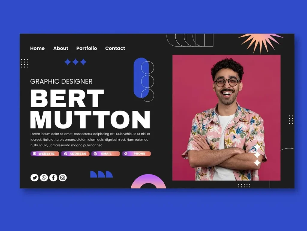
Example 1: A Portfolio Website
Take a look at any top-tier designer’s portfolio site. You’ll notice clean layouts, stunning visuals, and intuitive navigation. Every element is carefully chosen to showcase their work in the best possible light.
Example 2: An E-Commerce Site
A great e-commerce site balances aesthetics with functionality. Think high-quality product images, easy-to-use filters, and a seamless checkout process. Bonus points for personalized recommendations and a mobile-friendly design.
Example 3: A SaaS Platform
SaaS sites often have to explain complex products in a simple way. The best ones use clear, concise copy, engaging visuals, and interactive demos to guide users through the features.
Common Pitfalls to Avoid
Even the most experienced designers can fall into these traps. Here’s what to watch out for:
- Overloading the site: Too many elements can overwhelm users and slow down your site. Keep it simple.
- Prioritizing aesthetics over usability: A beautiful site that’s hard to use is worse than a plain site that works well.
- Ignoring mobile and accessibility: Don’t forget about users on smaller screens or with disabilities.
Tips for Designing Your Own Digitally Elegant Website
Ready to create your own masterpiece? Here are a few tips to get you started:
- Start with a clear purpose: Know what you want your site to achieve, and design with that goal in mind.
- Focus on UX and UI: A great user experience starts with a great user interface. Pay attention to both.
- Test and iterate: Don’t be afraid to make changes based on user feedback.
- Stay updated: Web design trends evolve, so keep learning and experimenting.
Wrapping It Up
Designing a website that’s both functional and beautiful isn’t easy, but it’s worth the effort. When you get it right, you create an experience that users love—one that looks great, works smoothly, and leaves a lasting impression.
So, what are you waiting for? Start designing with digital elegance in mind, and see how it transforms your site. And hey, if you’ve got any favorite examples of elegant websites, drop them in the comments. Let’s geek out over some great design together!

- The 2026 Australian PEO Handbook for International Hiring - March 9, 2026
- How AI Perfection Is Making Us Fall Back in Love With Flaws - February 12, 2026
- Perth’s AI SEO Scene: 7 Perth Agencies Optimising for the AI Answer in 2026 - January 17, 2026